Menu
Table of contents
Because even though your website looks absolutely great and your visitors are interested in your products and/or services, you can still see in Google Analytics that many people are dropping out of your online form.
This can have numerous reasons, of course, but often the cause lies with the form itself.
It doesn't work well or visitors simply aren't enticed well enough to fill it out completely and hit the submit button.
The former is easy to find out by filling it out yourself, but the latter can also be addressed.
In fact, with these 5 tips for more effective contact forms on your website, you will ensure more leads, customers and sales.
Simple, easy to implement and with immediate results ...
let's go!
1. Use as few fields as possible
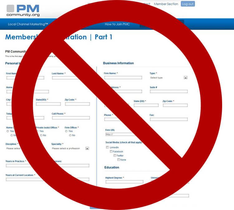
Most people, if not everyone, godly hate filling out long contact forms and therefore drop out at the mere sight of a screen full of fields to fill out.
And besides, why do they actually have to enter their BSN number, the title and artist of their guilty pleasure or the name of their cat?
The most effective contact form on your website has as few fields as possible where visitors only need to fill in the really necessary information.
This allows them to contact you quickly and easily.
Exactly what visitors want.
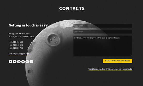
A field with the visitor's name, e-mail and message is sufficient in many cases.
Nothing more.
In fact, a study by leading HubSpot shows that forms with three fields achieve the best conversion rate on average.
So try three pitches, folks.
Three.
And if there really is no other way, at least as little as possible.

2. Don't ask for a phone number if you don't have to
Question: do you like leaving your phone number on a website?
Probably not.
And you're not the only one.
After all, your phone number is something personal, and you don't readily give that information to strangers.
In addition, most people are very busy during the day and do not want to be disturbed with a call from a sales department.
And besides, it's another extra field (and you just learned that effective forms have as few fields as possible).
Is an e-mail address sufficient? If so, please do not ask for a phone number.
If you do prefer to obtain a number to call, consider making the field optional rather than mandatory.
That already saves a mountain of conversions, too.

Source : http://seoexperts4all.com/strategies-boost-conversion-rates-online-business/
3. Communicate the added value
No one fills out contact forms for fun.
Rather, they still need to be convinced that they will actually get something back when they fill out the form.
What goes around comes around.
One of the easiest ways is by telling them exactly what they will get in return for filling out their data; communicating the added value.
In some cases, that's easy: a competitive, no-obligation quote, a demo, download or unique e-book that reveals the secret to a good burger, for example.
But in some cases, that's a lot harder.
After all, what exactly is your added value if your form is meant to allow visitors to simply ask their question?
Food for thought.

Source : https://optimusonline.nl/
4. Generate confidence
People fill out only reliable contact forms on websites.
That sounds like kicking in an open door ...
... and it is.
Yet the vast majority of web forms are totally unreliable.
In the eyes of visitors, that is.
Because what actually happens when they click "send," and what is done with the information they provide to you?
Is it secretly sold to third parties or -worse yet- are they immediately signed up for your weekly newsletter that they don't want?
Reassure your visitors and tell them exactly what happens once they have completed and submitted the form.
Are they moving to the next step in the product ordering process?
Tell them.
Get back to them as soon as possible with an answer to their question?
Tell them.
And then immediately mention that nothing else will be done with their data, if applicable.
Set expectations and then meet them.
This makes your visitors happy, and they then link that happiness back to your business.
Pro Tip
Make use of social proof if you have it!
Real testimonials or positive reviews near the infamous action button can do wonders for your contact form conversion rate.
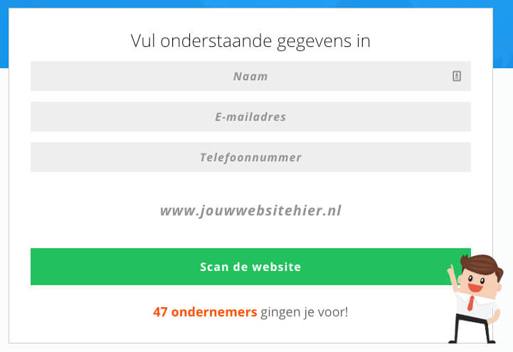
But something like "47 business owners went before you" can also persuade visitors to use the form.

5. Pay attention to design
Yep, design is important!
And so is the location of the contact form on your website.
As you may have noticed from the tips above, persuading visitors is not always easy.
It doesn't help then if there are all kinds of distractions around the form.
Things that attract attention.
Things that keep people from looking at the form, your added value and the elements that inspire trust.
Therefore, use enough whitespace around your contact form on your website to make sure people can't miss filling in the fields.
A button with an eye-catching, but appropriate (!), color can also help.

Bonus: provide a happy ending
Do you know it?
That you stand at the checkout counter at Ikea paying off a cart full of things you totally don't need?
Undoubtedly.
And that doesn't make you feel good, does it?
But then why moments later are you happily loading everything back into your car?
That's because Ikea has added a happy-end to the customer journey.
In fact, after paying, get another one of those tasty hot dogs or a refreshing ice cream (with family discount, of course).
That makes you happy and so you walk out of that twisted Ikea again with a smile.
The same goes for filling out a contact form on a Web site.
This is usually not a lot of fun, but you can still leave the fill-in-the-blank happy by rewarding them for all their hard work.
That reward can range from a cheerful thank-you page or automatically generated email to a code for 5 euros off your next purchase.
Whatever applies to your business.

Test your variations!
Fair is fair, the above tips do not guarantee success ...
... but will help you a long way toward a more effective contact form.
There is only one way to find out what works well with your target audience, and that is testing.
Test multiple variations of your web form and see which performs best.
With Hotjar, for example.
In doing so, be sure to let us know in the comments what you changed and what your results are!
Also read:
- Getting a website made: here's what to look out for from an SEO standpoint
- Here's what you need to know about Hotjar, heatmapping and installing Hotjar via Google Tag Manager
- Don't miss out on SEO opportunities: use Keyword Hero!
How do I ensure the privacy and security of the data entered?
Make sure your contact form complies with applicable privacy laws, such as the GDPR, and that data is transmitted and stored securely. Use SSL encryption and make sure sensitive data is not collected or stored unnecessarily.
How can I measure the effectiveness of my contact form?
Analyze the performance of your form by tracking how many people fill it out and submit it. Consider A/B testing different versions of your form to see which is more effective in achieving your goals.


Written by: Daniel Kuipers
Daniel is the founder of Online Marketing Agency. He constantly scours the Internet for the latest gadgets and tactics and blogs about them in understandable language. Well, sometimes.