Menu
Table of contents
Not having company information
Would you order something from a company that has no physical address on the website or no phone number? Or even worse, that both are missing?
At least I don't. Contact information builds trust, it makes potential customers feel that they can contact you directly and easily and that you are there for them.
So it works both ways. Not having company information creates distrust and having company information creates trust.
Pro tip: make sure the company information is in your footer and on your contact page.

Long charging time
There is little in the online world more irritating than a long loading time. No one wants to wait 20 seconds for a website or a specific page within that website to load.
Let alone someone wanting to spend several minutes to make a simple order in your web shop.
We live in an increasingly fast-paced world, so a fast website is part of that. So make sure your website is as fast as possible!
Pro tip: Read our article called "9 tools to test your website speed" and find out if your website is fast enough.
No use of buttons
People are very lazy by nature. This is true on and offline. So when people visit your website, you have to take them by the hand to send them to the right place in the right way.
During this process, you must make the visitor like your product or service. Show what the benefits are for the visitor, show who you work for, show what you are good at.
Redirecting those people is done through action buttons. For example, people enter on page X, then have to go to page Y and finally to page Z.
And when you don't use action buttons, that won't happen. After all, buttons are clearly clickable - and people like to click them.
Pro tip: Don't put the "Contact Us" action button everywhere. Direct people to your services, to your case studies, to the about us page and other pages that are important to the visitor.
Stock photos
There is virtually nothing you can do on your website that is more impersonal than using stock photos. People do business with people. So be sure to show pictures of you and your team.
Therefore, this conversion killer is twofold. On the one hand, you are not using your own photos, but on the other hand, people can immediately see that it is a stock photo.
A double disappointment, then.
Pro tip: write/think out every conceivable scenario and item you want photos of. Then have a photographer come by and take pictures of everything.

Unclear menu structure
An unclear menu structure is initially bad for your organic findability. This is because Google then does not know which page is where and how those pages can be found.
But an unclear menu structure is also bad for your conversion rate. Just substitute Google for Pete in the previous sentence:
"After all, Pete then doesn't know what page is where and how those pages can be found."
In other words, if your website is not clear enough and, for example, your contact page is hidden behind a dropdown called "About Us," this will have a negative impact on your conversion rate.
The same applies, for example, to hidden categories within your webshop, the about us page or your shopping basket, for example.
Pro tip: Draw out your menu structure on paper and draw lines between pages that are connected. Always make sure the structure is as simple as possible.
Making mistakes with your form
This is another one that I see come by often: errors in a form. Consider:
- Contact forms
- Forms for requesting quotes
- Sign-up forms for your newsletter, for example
But then what are the mistakes you can make? Well, for example, this one:
- A form with too many fields
- A form with too few fields
- Making fields mandatory that do not need to be mandatory
- A field that is not working for some reason
- A form that cannot be sent
Pro tip: test your form regularly and make sure you have around 3 to 5 fields per form.
Important content not immediately visible
People visit your Web site for a particular reason. Namely, they want to find what they are looking for.
So make sure you put that content right in front of it. Don't go putting a banner, a big chunk of text and 2 videos in between and, as you may have learned in school, save the most important content for the slot.
Start right here!
Do people expect a phone number to appear at the top when they google your search term? Put that one at the top! Do people expect a piece of information? Put that at the top! Do people expect a form where they can sign up?
You guessed it -- put that one at the top.
Pro tip: before you start working on a page, carefully consider the intent of the searcher. Ask yourself: what does this person want to achieve?
Not having HTTPS
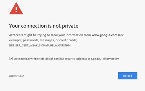
"Your connection is not private. Cybercriminals may be trying to steal your data from [WEBSITENAAM] (e.g., passwords, messages or credit card information)."
That's exactly the message Google Chrome gives when your website does not use an SSL certificate and thus does not have HTTPs.
This is by far the biggest conversion killer from this list because it means people are not even going to visit your website.
Pro tip: Care. Provide. One. SSL. Certificate.
No good mobile design
Websites without mobile design are thankfully a dying breed! There are fewer and fewer websites that are not mobile responsive where photos are skewed, buttons don't work, text falls out of focus and the menu doesn't work.
Terrible.
Pro tip: Build your website mobile-first when the proportion of mobile visitors exceeds 70%.
Not using the principles of persuasion (by Cialdini)
Of course, you cannot write an article about conversion (killers) without mentioning Cialdini. Dr. Robert Cialdini has described 7 influencing principles you can use to convince visitors of your knowledge, expertise and products or services....
A real conversion killer is, very faintly, the lack of those principles. Consider, for example:
- Failure to deploy reviews
- Failure to deploy scarcity
- Not using authority (logos of suppliers, labels and partners)
- No use of free giveaways
Pro tip: Make sure you always use Cialdini' s principles.
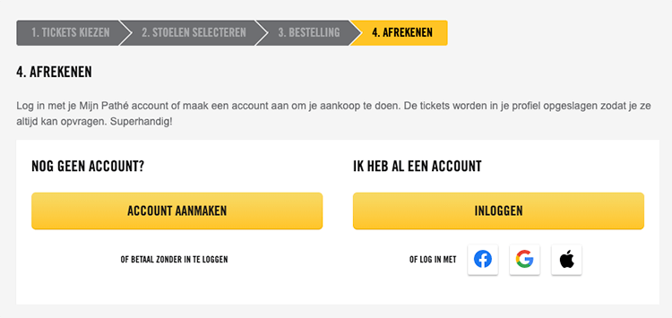
Not being able to checkout as a guest
For me personally, this is by far the biggest conversion killer from this list. When I can't checkout as a guest, it feels like a dagger in my back to me.
In fact, I find this so annoying that I haven't bought movie tickets from Pathé for years. Years ago I created an account there, but of course I don't remember my password.
When we want to go to the cinema last minute, you want to get tickets quickly. But then you find out that you can't use your e-mail address, because you have already created an account with it.
Terrible...
Pro tip: ask your friend to buy the movie tickets at Pathé so you don't have to do it yourself.
Pop-ups at the wrong times and places
When you deploy pop-ups in the right way, it can work well for you. But when you deploy pop-ups in the wrong way, it can also work negatively.
For example, I once encountered a full page pop-up in the payment process. And to make matters worse, I couldn't find a cross to close the pop-up.
Therefore, make sure the pop-ups appear in the right place at the right time. For example, when people want to leave your website or when they are reading your blog.
But so not when you are in the middle of the payment process.
Pro tip: make sure people can at least easily click away your pop-up.
The lack of a search function
How great is it that you can search for the topic you are looking for from any page and any time within a website? That's super convenient, isn't it?
You do that with a search function. You give people the ability to go directly to the right place within your website. People don't have to go rummaging through your website to find the information, but they can easily find the content right away.
In other words, you create less friction with a search function. And the less friction, the happier your visitors become.
Pro tip: test whether a search function that already completes the search result is pleasing to your target audience.
Not having a concrete goal within the website
Do you know the exact purpose of your website? Is that gathering email addresses?
Is that dragging in bells or is it realizing rock-solid sales?
Once you have that clear, then you can set up your entire website accordingly. Your text, your images, your pages, your menu, etc. I still regularly come across websites where this is not all in line.
People can buy something, request something, fill out a form or download something. Make sure it is very concrete for your target audience what they need.
Provide focus and do not give too many options, as this leads to choice stress.
Pro tip: open pages within your website and squint your eyes. Do you (and your target audience) see what the purpose of your website is?
Poor writing (Too much focus on SEO or not knowing your target audience)
'Are you looking for Hotel Arnhem? We are the best Hotel Arnhem. We as Hotel Arnhem are the best of ... ' Yes, these were really phrases I once came across on a website.
Texts that are too focused on SEO are mercilessly discarded by Google and will also convert poorly. Another common mistake within copywriting is not knowing your target audience.
Do you really know what your target audience's problem is? Do you really know what your target audience is up against? And do you really know who your target audience is?
If you don't know that, your lyrics will never be good. After all, you can't empathize and you don't know what to focus on.
Pro tip: Have a few people you fall within your target audience read your text and ask what they think of it.



Written by: Daniel Kuipers
Daniel is the founder of Online Marketing Agency. He constantly scours the Internet for the latest gadgets and tactics and blogs about them in understandable language. Well, sometimes.