Menu
Table of contents
My vision is that they can work, provided you use them in the right way. A way that suits you, your business and your customers.
And that's what I'm going to tell you all about today.
What is an exit intent pop-up?
Chances are you are already familiar with a pop-up. Somewhere in the lower right, lower left or just boom - in the middle of your screen.
For example, asking if you want to sign up for a newsletter or if you want a unique discount or download an e-book.
I myself also make use of it. Check it out!
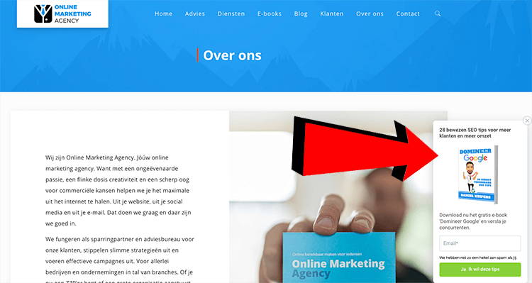
An exit intent pop-up is nothing but a pop-up that is displayed the moment you want to leave the website.
Typically, an exit intent pop-up is often very prominent and displayed in such a way that you can't actually leave the website without clicking away.
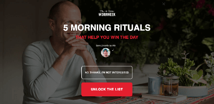
Why would you want to use an exit intent pop-up?
That reason is actually quite simple. When someone leaves your website, you lose them.
The exit intent pop-up is therefore a kind of last straw that you can use to still get something out of that visitor or reactivate him after all.
Since you lost that person anyway, you can absolutely still make them an offer or show them a pop-up or offer your e-book.
The concept is clear, though. Now I'm going to give you 10 important tips to get the most out of your exit intent pop-up.
Tip #1: Think mobile
You can build an exit intent pop-up yourself, of course, but you also have software to create the pop-ups, for example.
No matter which way you create the pop-up, you should always make sure that the pop-up works properly on all devices (and screen sizes). In fact, too often I see people create a pop-up and show it on desktop.
Then on mobile, the pop-up falls all over the screen and the website is not usable there.
And now I may hear you thinking, 'There's no such thing as mobile exit intent pop-ups, right? Because surely an exit intent pop-up is based on where the mouse goes?'
Yes, that's right. But so now exit intent pop-ups just exist on mobile.
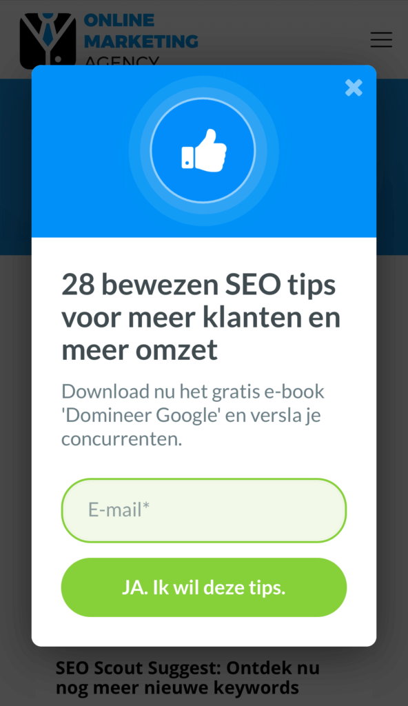
Tip 2: Make sure people can easily click the pop-up away
As I mentioned earlier, there is a group of people who hate pop-ups. So make sure that that group of people can easily click the pop-up away.
You can do this very easily by adding a cross in the upper right corner in a striking color. Otherwise, people get the feeling that they don't know what to do and are "stuck.
And that's not best for your image.
Tip 3: Clicking in the background
Tip number 3 is to think carefully about what happens when people see the exit intent pop-up and don't click on it, but rather around it.
There are then two possibilities:
- Nothing is happening at all
- The pop-up will be closed
There's no right or wrong here, but I want to give you particular thought. Closing the pop-up makes clicking away easier, but it may also be that you don't want to.
Tip 4: Don't make it too commercial
Make sure the exit intent pop-up fits you and your company. Make sure it is in your corporate identity and leave out all the frills.
Also, leave out the "BUY NOW WITH 50% DISCOUNT" button and keep the pop-up subtle. Above all, respond to the added value you want to offer as a company.
In my case, that's mostly my knowledge and expertise, because that's very important in my field. So distributing an e-book through an exit intent pop-up would fit this nicely.
And if you only want to use the pop-up to directly increase sales, that's not going to work anyway. People are allergic to that.
Hatsjoe!
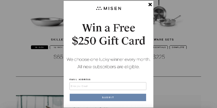
Tip 5: Make sure the exit intent pop-up is not set too sensitively
A major annoyance within exit intent pop-ups is that the pop-up is shown when people do not want to leave the Web site.
That has to do with the pop-up being tuned too sensitively. Then people may just want to click on your logo in the upper left corner to go back to your home page (or upper right corner to contact), but then immediately see your pop-up.
You absolutely should not want that either.
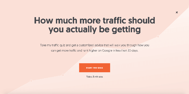
Tip 6: Make your title stand out
When people want to leave your website, they are often already working on the next step. For this reason, it is important that the title or payoff of your exit intent pop-up be super clear.
Make sure the reader is taken back to the most important part of your pop-up, so to speak. In addition to obviously making the benefit to the reader clearer and more noticeable, you can obviously make the rest around it less inconspicuous.
So work with the right colors, the right fonts and the right font size. The example below shows how to deploy this .
Tip 7: Keep it simple
Make your exit intent pop-up as simple as possible. Leave out all the fuss and get to the heart of your message. As I said in tip 6, people are already thinking about the next thing they are going to do.
They don't have time to read 5 lines of text, so they won't give you that chance. Think about which pain point is most important, capitalize on that and offer it to them right away.

Tip 8: Create page-specific exit intent pop-up
Relevance is everything. If you are on a blog about SEO, then you are interested in SEO. So show an exit intent pop-up about your SEO e-book when someone leaves your SEO blog.
And show an SEA exit intent pop-up when someone leaves your SEA blog.
I think you get it now.
Make sure the exit intent pop-up matches the content and page the visitor is currently browsing.
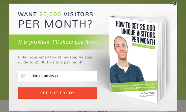
Tip 9: Cialdini's principle: reciprocity
What goes around comes around. Right? If your goal is to collect e-mail addresses, don't just create a pop-up with "Leave your e-mail address and we'll send you tips every week.
No. Write a quality e-book, white paper or create a free online video training and offer it in exchange for the email address. Of course, be AVG proof.
That's what we call reciprocity. I do something for you, you do something for me. Or the other way around.
Besides reciprocity, there are other persuasion principles you can use. I covered those in a previously written blog: Cialdini's principles and how to deploy them on your website.
Tip 10: Make use of A/B testing
Every target audience responds differently. For that reason, you can never be 100% sure in advance that the image of your e-book should or should not be there.
Or that the button should be orange instead of green. Or that you need to start working with reciprocity instead of authority.
So start with an exit intent pop-up that you think is good. And A/B test each element to come up with the best pop-up.
Bonus tip: always test only one tweak at a time, though, or you won't know which tweak caused which impact.
My favorite tool for pop-ups and exit intent pop-ups
As I started working with marketing automation, e-books, forms, etc., it was time I went to a solution that didn't require a web developer.
It was also important that all the tips mentioned above could be applied and that I had complete freedom to do so to my heart's content. My choice ended up being OptinMonster.
With OptinMonster I can really do everything I need ... AND much more. Meanwhile, I have been using OptinMonster since January 2020 and I am more than satisfied.
I like the software so much that I even wrote a review about it: OptinMonster review: The best lead generation software.
This article was written May 29, 2020 and updated June 28, 2023.
What is an exit intent pop-up?
An exit intent pop-up is a pop-up that is displayed the moment a user wants to leave the Web site. This pop-up is often prominent and displayed in such a way that the user cannot leave the Web site without clicking the pop-up away.
Why would you want to use an exit intent pop-up?
An exit intent pop-up can be used to accomplish one more thing with a visitor who wants to leave the Web site. It is a last chance to retain or reactivate the visitor. Through an exit intent pop-up, for example, you can make an offer, show a pop-up or offer an e-book.
How do you make sure people can easily click away the exit intent pop-up?
To ensure that people can easily click away the exit intent pop-up, it is important to add a clearly visible cross in a striking color, usually in the upper right corner of the pop-up. This makes users feel that they can close the pop-up and are not stuck.
What are some tips for getting the most out of an exit intent pop-up?
Here are some tips for getting the most out of an exit intent pop-up:
- Make sure the pop-up works well on all devices and screen sizes.
- Provide a clearly visible cross to close the pop-up.
- Consider what to do if users don't click on the pop-up, but around it.
- Test different elements of the pop-up to optimize its effectiveness.






Written by: Daniel Kuipers
Daniel is the founder of Online Marketing Agency. He constantly scours the Internet for the latest gadgets and tactics and blogs about them in understandable language. Well, sometimes.