Menu
Table of contents
So it was time to bite into it. After a few months, I knew enough about it so I decided to write an article with 7 beginner's tips for Data Studio.
Now, almost a year on, my Data Studio skills are at a much higher level and so I thought it was time to give you 10 Google Data Studio tips for advanced users.
Tip 1: Create segment within a graph or chart
All these 10 tips did not come out of the blue. I discovered them because, in fact, I needed them myself for our clients.
Therefore, for each tip, I will also show a concrete example of how I used.
The first is to create a segment. For some of our clients, we are responsible for multiple channels such as SEO, SEA, email or, for example, the Facebook Ads.
But with some, for example, we only do search engine advertising. For that reason, we then want to take out all the other data, because that client doesn't want or need to see that.
Take one of our webshop customers, for example. There we wanted to create a graph showing only the sales that came in through organic search.
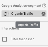
Once you have created the graph, you can do so very easily by clicking on 'add a segment' on the right.

Then look for "Organic Trafific" (or any other segment you want to show) and click on it.

Don't want to use your segment anyway and delete it again? Then click a cross to the right to 'Organic Traffic'.
Tip 2: Use Google Spreadsheet as a base
On to tip #2. Data Studio, of course, is known for allowing you to connect just about anything to it.
But what if you have data that doesn't come from Analytics, for example? Data that you manually add in Excel every time, for example?
You can also show that very easily in Data Studio!
Take, for example, the table below (the data has been filtered out because it belongs to a customer).

The client keeps track of this neatly at the beginning and end of the year, but wanted to have this in Data Studio as well. You can do this very easily by creating a Google Spreadsheet and putting the data in there.
Google Data Studio will automatically grab the headings you use on row 1 and in column A as dimensions and statistics. So you don't have to do anything for this.
This is how we put the above data into a Google Spreadsheet:

Once you have noted the data, you can then go back to Data Studio. There you create a table, for example, and then choose Google Spreadsheets as your data source.
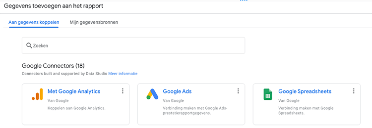
Select the spreadsheet you just created, click add and your data is linked. Then all you have to do is set up the appropriate dimensions and statistics.
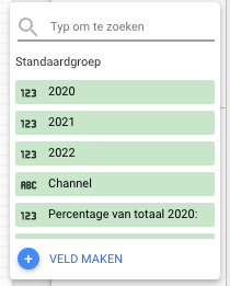
And as you can see, those come 1-to-1 from your spreadsheet.
Tip 3: Make something report level
That was quite a hefty tip, don't you think? On to something easier to explain and pick up.
In almost all of our Data Studio reports, we use a period selector. This is a feature that allows clients to customize the default period of the reports themselves.

We always manually put the period picker on each page so that it appears on every page. But what was happening? Customers were moving from one tab to another, and the period picker data was not remembered.
It constantly went back to the default period. So incredibly annoying.
Fortunately, Data Studio has a handy feature for that. Namely: create something report level. With this, you can have your period selector, a chart or, for example, the client's logo reflected on every page with the click of a button.
Without adding everything manually and without losing the data.
Tip 4: Create your own statistic or dimension
In tip 2, I explained how to get your own data into Data Studio. But what if, for example, you want to create your own statistics or dimensions?
So for example 1 simple number, formula or adjustment? Then you don't have to create a Google Spreadsheet, but then you can create your own dimension/statistics.
You can do this by right-clicking "add statistics" and then clicking "create field.
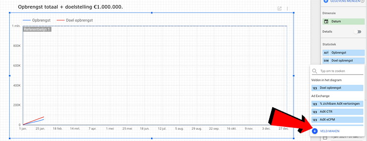
The possibilities are then endless. You can enter a number and make it go times 2 per day, for example, but you can also use dozens of other formulas and possibilities.
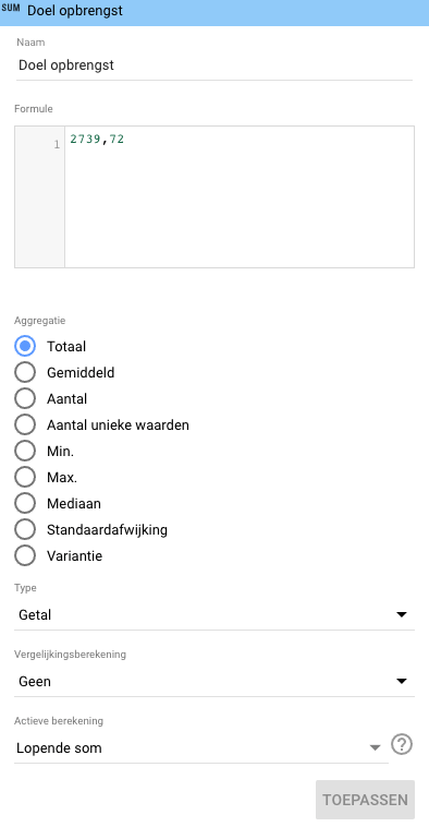
We are now using it for a number of clients to determine if we are on track in terms of sales. We do this as follows:
- We first find out the customer's revenue goal
- We divide the turnover target by the number of days in a year
- Put that number into the formula
- We set the active calculation to "Running sum.
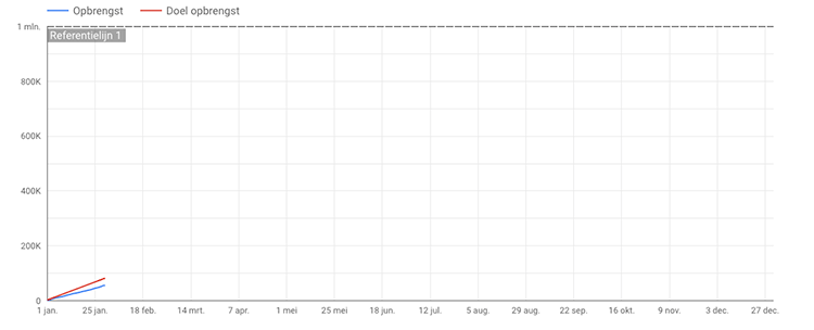
Once you've added those to your line chart showing real yield (and set it all to cumulative), you'll get a nice graph showing very easily whether you're on track or not.
In the chart below, this is the "target yield.
Tip 5: The 'style' tab within your chart (and its various options)
Discovering the style tab was perhaps the simplest discovery within Data Studio, but one that subsequently opened the most new ideas, opportunities and doors for me within Data Studio.
In fact, when you are editing a chart, you can click on "Style" to the right of "Data.

There you can then:
- Adjust whether you want a line or bar
- Showing your data cumulatively
- Add trend line
- Adjusting the axes
- Display points
- Add reference lines
- Adding a grid
- Customize Colors
- Making a line flow
- Customize fonts
- Formatting the legend
- And much more.
You should definitely dive into this. Especially if, for example, your client wants to flip an axis because it is important, if you want to play with the colors, if you want to bring out certain data more, or if you want to make other useful adjustments within your chart.
Tip 6: Use advanced default period
I told you about the standard period once before in this article. In other words, the period whose data the chart shows.
You can set this to automatic, but you can also determine this on a per-graph basis by setting it to "custom.

If you set it to custom, you have a host of options. You should dive into that.
We mainly use the following setting: set the start date to, say, the first day of the year and set the end date to today minus 1 month.
You will then always get only the data from the last full month, because you subtract 1 month. This is because in some cases you don't want to see your 3 days of data compared to a full full month.
Someone within the organization who doesn't realize this may start asking questions about it. For example, why are we doing so poorly this month? Or how come we are dropping so much?
Tip 7: Cumulative data combined with a reference line
If you've been paying attention, you've already seen the words cumulative and reference line pass by.
Cumulative means nothing more than constant addition. In certain situations you might want to do that. For example, when looking at annual sales (and comparing them) just like we did in tip 4.
Below is an example of a non-cumulative line (left) and cumulative line (right).

As you can see, you can easily make your data look rosy or not so rosy here. But I didn't tell you that ;).
I also find the reference line very interesting. You can turn that on under the 'style' heading when you are modifying a graph.
You can put your revenue target in there, for example. Or you can use it to show certain benchmarks / ranges. You can do this by using one reference line, but also by using two reference lines.
For example, two reference lines you would want to use with a minimum number to be reached in conjunction with your goal you want to achieve.

Tip 8: Work with a filter
The difference between a filter and a segment within Google Data Studio is not even that much. Whereas a segment allows you to select a piece of data, a filter allows you to include or exclude a portion of the data.
The big difference is that with a segment you can choose only one option and with a filter you can set up "and/or rules.
You can use the filter function for an awful lot of different possibilities. We mainly use it for removing or only including certain data. For example, consider data from a specific channel such as Pinterest or Google Ads.

Tip 9: Google Analytics 4 and Data Studio
This is the only tip in the list that is a bit less concrete than the rest. In fact, Google Analytics 4 is only a few months old as I type this article.
This means that not everything has been incorporated into Analytics 4 yet, certain features are still missing and there is still work to be done to make the tool complete.
This also impacts your Data Studio. In fact, the standard Data Studio we use has had to be modified and does not yet meet our requirements.
It's not us, it's Google. It doesn't share/show certain data yet and so we can't finish our Data Studio.
Our tip to you? So above all, keep testing and make sure your Data Studio based on Google Analytics 4 data is just waaay down the road.
Tip 10: The style tab within your diagram (and its various options)
Hey. The "style" tab. You might recognize that one.
Only the content of the 'style' tab is substantially different when using a bar chart, for example.
By the way, this applies not only to a bar chart, but to all the charts and graphs you can use. So look closely at this tab for all diagrams, because there are differences.
With a bar chart, for example, you can again adjust the colors, determine the number of bars or, for example, have the bars stacked.
The example below shows when that can be useful.

So. If you've read the article I mentioned in the introduction as well as all these tips, then you already really know a lot about Google Data Studio.
All this took me dozens of hours to learn and you will learn it in two little blogs. Nice and easy, right? Now I do have 1 bonus tip for you:
Get started yourself and, above all, use YouTube and Google. Anything you want to know now, someone has probably already thought of or done once.





Written by: Daniel Kuipers
Daniel is the founder of Online Marketing Agency. He constantly scours the Internet for the latest gadgets and tactics and blogs about them in understandable language. Well, sometimes.